.png)
INDIGO - genrative AI chat platform
The Next-Generation Generative AI Conversational Platform for Indigo (6Eskai Next-Gen)
Gen-AI
UI design
Ux design
Case study
PROJECT OVERVIEW
Duration -
5 months
Role -
UI/UX Designer
Tool -
Figma for UI and prototyping
FigJam and Miro for mapping
flows and intent models
Notion
for conversation scripts
UserTesting.com for
remote tests
ROLES & RESPONSIBILITIES
Scope of work -
I led the UX for the chatbot experience across research, IA mapping, conversation design, UI, prototyping, and usability testing. I collaborated with the product manager, engineering lead, and customer support teams to understand operational constraints.
Team -
Product Designer (Me), Data Scientist, Data Analyst(2), Indigo Design team (3), product Manager, Engineers
PROJECT OVERVIEW
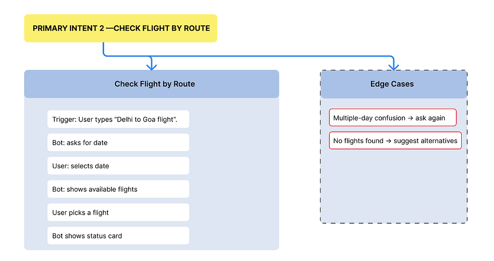
Indigo handles thousands of support queries every day, most from travelers who are either short on time or under stress. Their existing chatbot acted more like a rigid menu than a conversational tool. People had trouble finding actions, struggled with long chat loops, and often dropped the session midway.
The goal was to redesign the chatbot with a strong foundation in UX and conversation design so users could finish time-sensitive tasks like web check-in, flight status, cancellations, and baggage queries in minutes, not 15–20 clicks.
Phase- 1
PROBLEMS
The core issues with the earlier chatbot
After reviewing chat logs, support tickets, and user feedback, three problem patterns were clear:
The chatbot placed too much cognitive load on users
It responded with generic messages like “How can I help you today?” without offering shortcuts or suggesting common actions.
Users were forced to type, guess keywords, or scroll through long text. Most gave up early.
Repeated input caused frustration
Users entered a PNR, then the chatbot asked again after a few steps because the flow reset.
This felt careless and made people distrust the system.
No contextual awareness
If a user asked “What’s my baggage allowance?” after checking their PNR, the bot didn’t link the two and responded as if it was a new conversation.
The effect
These issues created friction at the worst possible time—during travel, when people needed clarity fast.
The challenge was to design a system that guided users naturally, kept conversations short, and remembered context long enough to feel dependable.
UNDERSTAND & DEFINE
This phase anchored our design effort, clarifying the "Why" behind the project and empathizing deeply with the user's emotional and operational needs.
a. Business Understanding

b. User Understanding
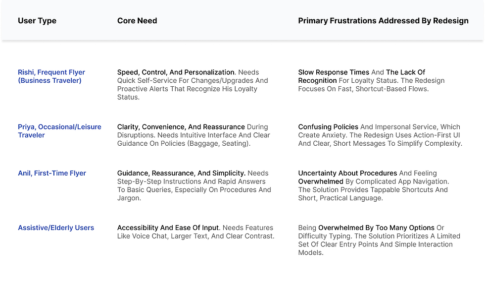
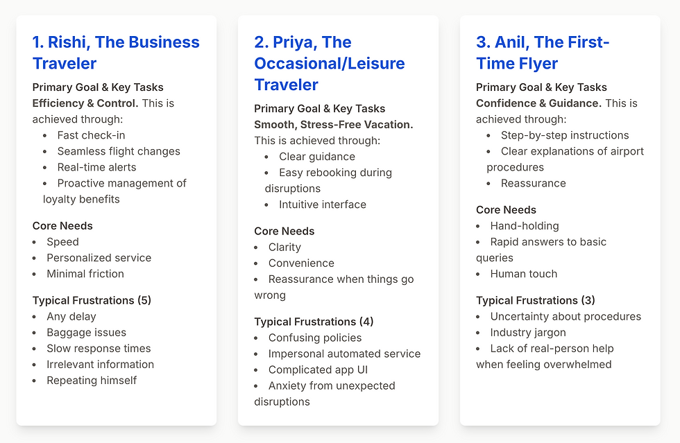
Our deep dive into passenger needs revealed a spectrum of emotional and practical struggles across different traveler segments.
RESEARCH & INSIGHTS
This section gets very detailed because research shaped almost every design choice.
a. Analytics and Logs
I read through 200+ real chat transcripts. Key patterns emerged:
-
65 percent of messages came from the same 7 intents-
Flight Status
Web Check-In
Reschedule
Cancel Booking
Baggage
Refund
Talk to Support -
Users typed extremely short queries
-
Most sessions dropped at the first long response
-
PNR and passenger selection caused the highest frustration
Logs showed a clear drop-off moment: When the bot asked for more information than needed, too early, or more than once.
b. Stakeholder Interviews
I spoke with the support team, product manager, and operations team.
Insights:
-
Agents received many repeated questions
-
Many users moved from chatbot to voice support due to repetitive questioning
-
Agents wanted the bot to collect basic context before escalation
-
Engineering team had limited NLP capability; majority was rule-based.
This helped align expectations. The chatbot wouldn’t be “smart.” It would be structured, predictable, and helpful.
c. User Interviews
I interviewed 30+ frequent flyers who had used Indigo multiple times.
Core insights:
-
People want clarity over personality
-
They prefer tapping actions during travel
-
Many don’t know exact airline jargon
-
They expect an instant way to jump to humans
Direct quotes shaped the tone of the bot’s messages (short, practical).
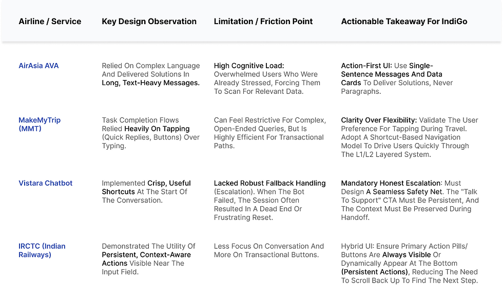
c. Market & Competitor Analysis
Our competitive analysis revealed that while AI chatbots are becoming standard, a significant gap exists in truly empathetic, transactional, and transparent AI solutions within the airline industry.
Phase- 2
REDEFING GOAL/SOLUTIONS
-
Shorter task completion time
-
Less repetitive input
-
Clear paths for the top 6–8 intents
-
Reduced jumps between chatbot, website, and call center
-
A flow that felt reliable even during stressful situations
This project wasn’t about making a “smart” chatbot. It was about making a useful one.
MOSCOW method
We used the MOSCOW method to prioritize features based on their impact on user pain points like redundant processes, unclear feedback, and poor visibility. This helped us focus on high-impact improvements that would enhance efficiency,
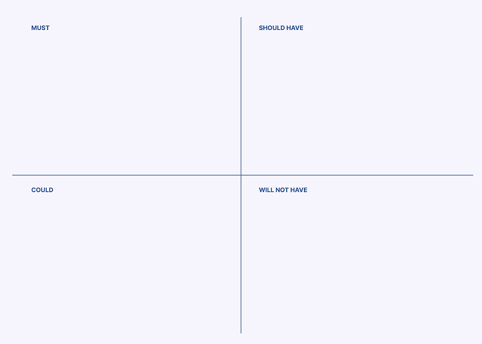
Clear Entry Points (Top 6–8 Intent Shortcuts), Contextual Memory (Remembering PNR),
Layered Conversation System, Action-First UI (Cards/Buttons), and the Honest Escalation path. These are mandatory to solve high cognitive load and repetitive input.
Critical Edge Case Mapping (e.g., Cancelled Flight flow), PNR UI Enhancements (Auto-formatting, Progress Indicators)
Post-Action Follow-ups. These significantly boost reliability and reduce anxiety.
Real-time Push Notifications (Beyond chat): SMS/WhatsApp links for proactive alerts.
Advanced Multi-Passenger Flows, Voice Input, and Detailed UI Polishing. These features have a smaller impact on the core goal and can be deferred.
Fully autonomous, complex complaint resolution (e.g., legal disputes without human review)
USER PERSONA
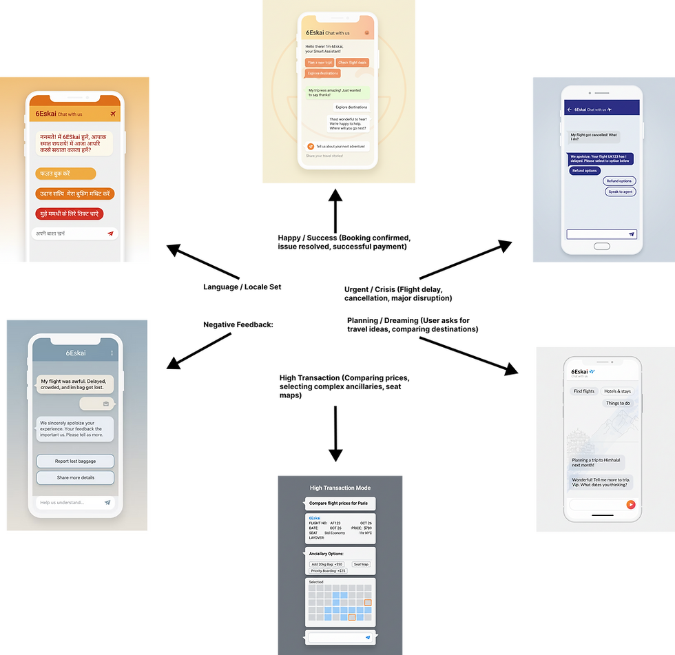
MOODBOARD
This Dynamic Moodboard studies how a UI's visual elements (color, type) fluidly adapt to the user's emotional state (anxious, happy) and task context (planning, issue resolution). The goal is to create an empathetic, supportive, and intelligent digital experience.
INFORMATION ARCHITECTURE
a. User Flow
I translated conversation blocks into flow.
-
Quick reply chips
-
List-type message cards
-
PNR entry with auto-formatting
-
Boarding pass card UI
-
Post-action follow-ups
The prototype simulated entire conversations so stakeholders could test them end-to-end.
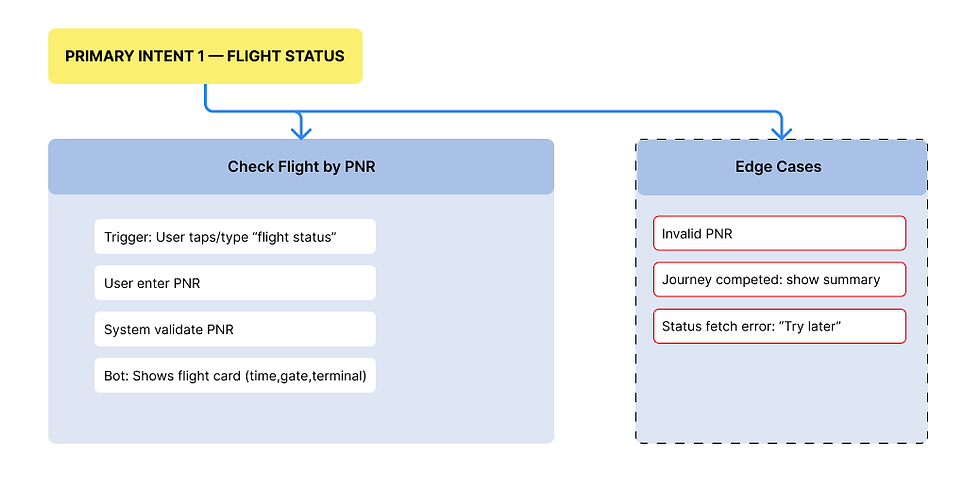
b. Edge Case Mapping
built a separate layer of flows to catch problematic moments:
-
Wrong PNR
-
Old PNR with completed journey
-
Multi-passenger bookings
-
Cancelled flight
-
Repeated intents
-
User typing mid-flow
-
User switching to refund flow after starting check-in
Each edge case had a planned response to avoid loops.
Phase- 3
IDEATION
This phase was about generating creative solutions, ensuring the AI's personality aligned with user needs, and defining the platform's structural foundation.
The Full-Screen Web Application
The OS-Level Sidebar/Panel

The Embedded Pop-up Widget

The Modal Window/Overlay

The Mobile/App Integration
The Dashboard/Workspace Integratio
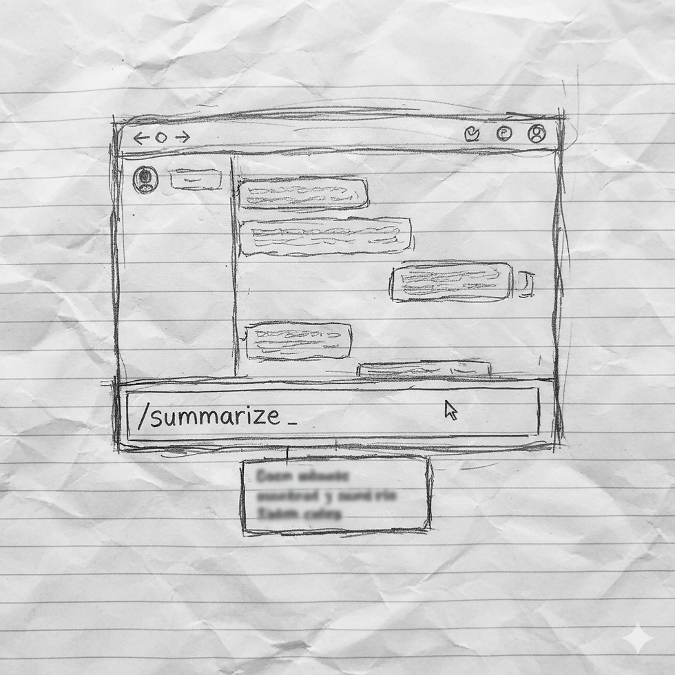
The Command Line/Slash Command
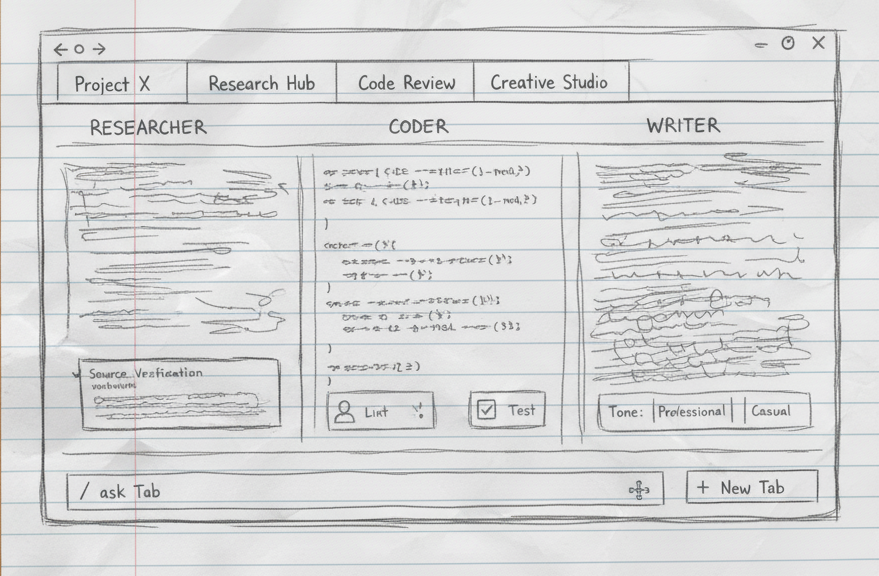
The Multi-Agent/Multi-Tab Dashboard
Final Ideation
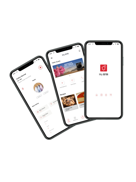
The Mobile/App Integration style works effectively on both mobile and web because it follows a Mobile-First strategy focused on simplicity and consistency.
On mobile, the design provides the optimal experience: full-screen focus, high readability, and easy tapping of prominent actions like the sticky input bar and microphone button.
On the web/desktop, this mobile design is intentionally retained in a narrow, centered column. This prevents the UI from becoming overly complex or distracting, ensuring the same intuitive flow and identical design language for the user. It scales effectively without losing the key elements that make it quick and accessible on a smaller screen.
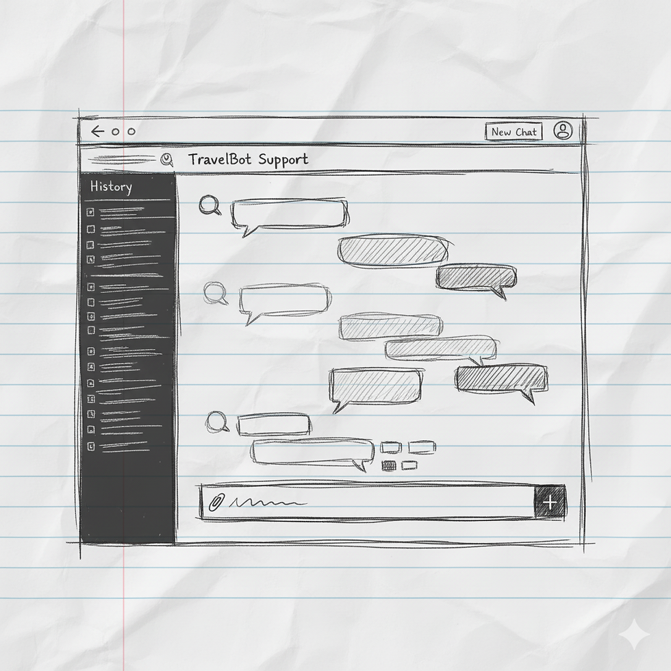
Low-Fi
This low-fidelity wireframe focuses on the core structure of an AI chat interface. It clearly differentiates the "Chat Window" for dialogue from dedicated "Action" buttons for quick user inputs. The prominent input bar at the bottom confirms the dual interaction model: guided actions for common tasks versus free-form text for detailed queries, streamlining user interaction.

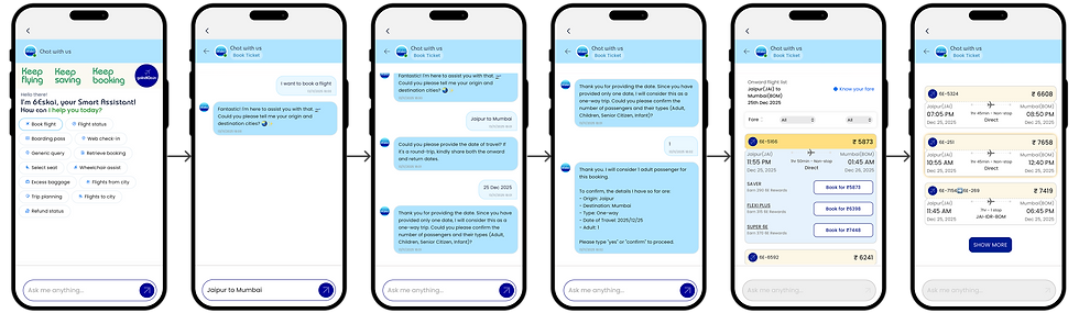
High-Fi
This high-fidelity design meticulously incorporates IndiGo's brand language. The use of vibrant blue hues and clear, modern typography aligns with their existing aesthetic. Crucially, the functional and straightforward layout—emphasizing quick actions and efficient task completion—mirrors IndiGo's ethos of "keeping flying simple" and customer-focused, ensuring a cohesive brand experience within the chat.
WORKING PROTOTYPE

MOBILE APP
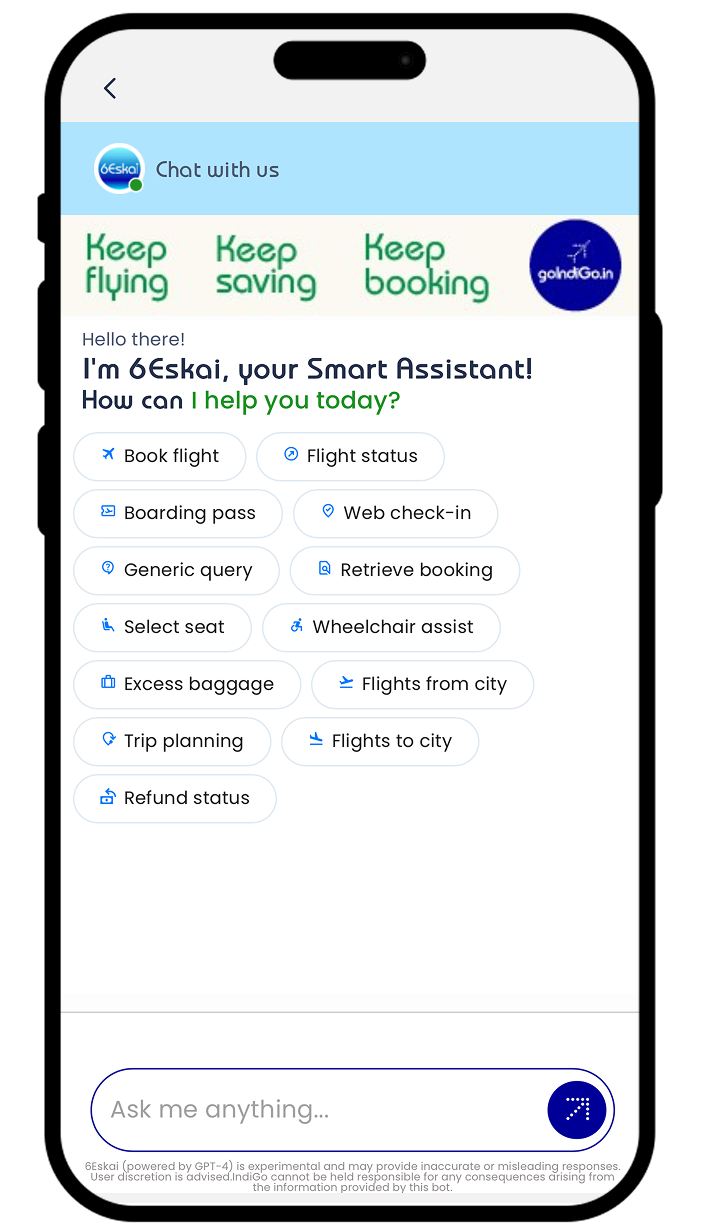
Design Decision: The Top-Right Header Icon
-
Placement in the Primary Action Area: The icon is placed in the top-right corner, immediately next to the primary airline logo and any other critical header elements (like system alerts). This is a globally recognized location for help, profile, or search functions.
-
Visual Prominence: It utilizes the clear 6Eskai branding/iconography (the bright, circular logo) to ensure it stands out within the otherwise functional header elements.
-
Full Screen Modal Activation: When the user taps the icon, the chat interface opens as a Full Screen Modal overlay, completely taking over the viewport. This is essential for mobile design as it dedicates the maximum screen real estate to the conversational interface.
4. Actionable Prompts: Once opened, the chat clearly presents Quick Action Pills (e.g., Web check-in, Retrieve booking, Refund status) at the top, immediately guiding the user toward transactional queries.

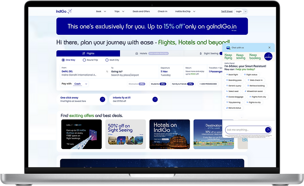
WEB PLATFOARM
Design Decision: The Floating Action Button (FAB) Approach
-
High-Contrast Icon: The icon uses IndiGo’s primary color against a white/light blue background, ensuring high visibility regardless of the page content.
-
Viewport Anchor: The FAB uses a fixed position (position: fixed;) to remain visible across all dashboard scrolls and responsive breakpoints.
-
Drawer/Overlay Activation: Upon clicking the FAB, the full chat interface opens as a side-panel drawer (overlay). Crucially, it does not navigate the user away from the main dashboard. The underlying content remains visible, but it is often slightly dimmed or overlaid to draw focus to the chat interaction.
-
Contextual Intelligence: By keeping the chat in the main dashboard viewport, the AI is positioned to leverage contextual data (e.g., current search parameters, user location, logged-in status) to offer more relevant suggestions, such as the pre-populated Quick Action Pills ("Book flight," "Flight status").

RESULT
27%
increase in task completion across the top three intents.
19%
Conversation drop-offs decreased by 19%.
1.5m
Average task resolution time dropped from 2.6 minutes to 1.5 minutes.
23%
Agent handovers dropped by 23%
31%
Self-serve usage grew by 31% in the first two months
4.1
Customer Satisfaction Score went from 3.4 to 4.1 for chatbot-assisted tasks.
Thanks for checking out this project!
See how I tackled a different design challenge in other projects. Let me know what you think! I'm always looking for feedback."